2.1 and 2.2: Usability is customer service (aka: Why geek speak should never make it to error messages and why a single path to problem resolution should never be the option)
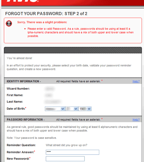
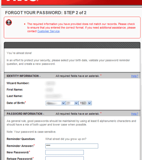
Usability failures can come in many flavors when the interface mechanism involves a computer. Most of these failures are directly attributable to a defect in the process: someone without the experience and flexibility to understand that people don’t all think the same way is allowed to control what is essentially a customer service process. Or, to put it another way, some manager let the programmers decide what the best method was and let them write the error messages.
I have to travel at the end of May and I will need a rental car. Avis is my preferred outlet largely because their at least 15 year-old policy of waiving the second driver fee for two people who live at the same address regardless of their relationship is a low-key way of supporting lesbian and gay couples. Primarily it’s the “as folk” crowd that gets the benefit from this rule but it harms no one else in the process. So, when I need a car I typically go to Avis.com to rent one.
My insurance company has a special deal where you can become a “preferred member” without any fee but the catch is you have to be logged in to your Avis.com account to do this. Now, I rent a car three, maybe four times a year which means my knowledge of my Avis.com account particulars dims rapidly.
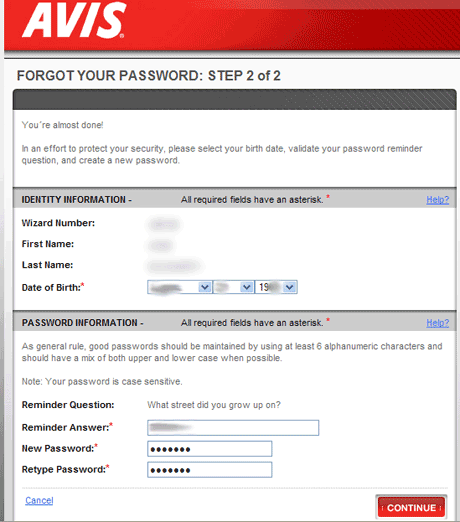
I’ve got a “wizard number” which I dig out and use to try to log in. Then I realize…I have no idea what my password is. I try a couple of things using my standard password format. No love. So, I follow the “Forgot your password?” link and this is where the trouble starts.


Unlike 99% of other businesses out there, Avis has rejected the process of sending a randomly generated password to the user’s registered e-mail address so that when someone can’t remember the answer to her secret question she can still have access to her account without burning time during a work day. This is a key indicator that programmers controlled laying out this customer service path. They did what was easiest for them on the front side of the process with no regard to what would be easiest for the customer or better for the company in the long run.
So, piss poor usability makes for bad customer service. And yes, I will be asking them about now that I finally have time to call them during business hours (two weeks after I already made my car reservation over the phone).
Oy, I hate this one on multiple levels: a) having to maintain all those passwords across multiple sites. At some point, I end up a mess of permutations to satisfy the different requirements: stupid (sites I don’t care about), stupid1 (because they want a number), youAREstupid (caps), s-t-u-p-i-d (non-alphanumeric), and so on.
b) having a limited supply of secret questions. Note to site vendors: you aren’t getting my mother’s maiden name…. and it’s been over twenty years since I was in high school, making it less likely I’ll remember a mascot. If I could remember it, I’d make one up: Mighty Dust Bunnies
c) And while we’re at it: I hate the little cards with my membership number on it. If I actually carried those in my wallet, I wouldn’t be able to sit down. Index it to a phone number or email address (like the grocery store does).
Hah, I just ran into another usability annoyance today by a site that “forces” you to create a password to gain access to information. (Because, you know I have nothing better to do than login repeatedly to a site, checking for updates.) The error: “your password contains illegal characters” What next, “your password is too sarcastic?” “I’m sorry, you’re using a dangling participle.”
Actually, this is security best practice. Providing error messages that are user friendly often give up to much information to help guessing attacks. The secret questions are designed to be something easy to remember but often they are pretty much limited to common knowledge. Its rather trivial for someone to guess this information if one spends any time participating online. Tha’ts how that kid broke into Sara Palin’s email account this past summer.
http://blog.wired.com/27bstroke6/2008/09/palin-e-mail-ha.html
Here is an article by Bruce Schneier that talks about this.
http://www.guardian.co.uk/technology/2009/feb/19/insecure-passwords-conflickerb-worm
He recommends a program he created for Windows that keeps passwords – I use Roboform because I can’t remember them all either and I’ll sign up for a site then end up not going back for a while.
Yeah, sorry. Not buying that. The major way that the kid hacked Palin’s e-mail account is due to the fact that Yahoo! doesn’t require strong passwords. Six digits…that’s nothing. How about 12, or 14? How about requiring both upper and lower case and a number and a special character?
I get what you’re saying but from a communications perspective it’s possible to have both security and clarity and this is clearly not concerned about clarity at all.